In science, we try to understand the world by building models and theories that describe it. You see an apple falling on your head, think, “oh, maybe that’s how the planets move, too”, and you write down rules that allow for the motion of planets and don’t allow for some phenomena you do not see, like things falling upward. You call the collection of those rules your model, or theory. When you have your model, you perform more experiments to test it, and every time your model’s prediction roughly matches your observations, you get more confident that your model is correct.
What does it mean for a model to be correct? This is where the trouble starts. In school we learn that classical mechanics is a pretty good approximation of reality, but quantum mechanics and relativity is the correct theory of how the universe works.1 This framing has always bothered me: If Newtonian mechanics is wrong, why do we still use it so damn much?
Say you throw your keys out the window, and you want to calculate the path they will take to the ground as exactly as possible. So you get out your pencil and notebook and you start scribbling. Should you do your calculations relativistically? It would be more work, but you want to be really exact, so you add a bunch of γ’s everywhere and do your calculations relativistically. Then you notice that you’ve been assuming a flat earth the whole time. Oh no! All right – the earth’s a sphere, right? Let’s use that and we get an ellipse instead of a parabola for the flight path of our keychain. So – is the result more accurate than the classical, flat-earth one? Certainly not a lot more, but maybe a little? Nope. Not one bit. Why? Because the difference the air resistance makes, and the uncertainty of the direction you’re throwing in is much bigger than the difference a relativistic calculation could make.
This still doesn’t mean that objects in our everyday lives have a different nature than single electrons or supermassive black holes. It just means that, if you put enough electrons and protons and stuff together, and you don’t make them too dense or too fast, you can predict what they’re going to do by using the model of classical mechanics.
Many physics students, when they’re starting out, seem to feel like they’ve been promised something. That they’ll be led behind the curtains of reality and shown how the world really works. They seem to accept Newtonian mechanics – it works, after all. Medium sized objects, apparently, are Newtonian in nature. But it doesn’t take long for the disappointments to start. “Ideal gases don’t exist in nature, but it’s a simple model that works relatively well for lots of stuff,” they tell us. We’re not happy, but we’ll take the approximation, for now. We’re relieved when they teach us the “real gas” models, like Van der Waals gases. Then it gets worse again: “Ideal fluids are a pretty absurd approximation. There are no ideal fluids in the real world, and for most fluids, you don’t even get very good results using this model. But it’s simple, and it teaches the principles that you need to understand to work with better fluid models later.” We’re not taught the more complicated fluid models in that semester, and it leaves us with a quasy feeling. Why are we being taught a rough approximation instead of the correct model?
After a few semesters, the students get herded into a lab, to perform their first experiments themselves. Their belief is already shaken by countless lectures only teaching rough approximations instead of the real thing. But this is worse. Here, they finally see how the sausage is made. “All of physics is just estimations and approximations!” they exclaim. “Nothing here is exact!” It slowly sinks in that this is not just a rough approximation of what physicists do. Physics really is just approximations. Dutifully, the students draw error bars in their hand-crafted plots of noisy data, and wheep.
What’s important is that this isn’t a bad thing, and especially not a preventable thing. The approximations aren’t the result of laziness. The small inaccuracies in every scientific theory are the result of countless hours of patient, skillful labor. It’s awesome that we can make very accurate predictions about the behavior of gases just using pV=NT, instead of calculating the exact position and momentum of every elementary particle in our system. Because, by the way, that “system” is the entire universe. It’s super cool that we can just pretend planets are single points in space, with a mass and no size, only feeling the gravity of the sun and not each other’s, and still predict their orbits with great accuracy. Planets aren’t spheres, their orbits aren’t circles, Kepler’s Laws of Planetary Motion aren’t woven in the fabric of the universe, and yet, pretending all this is true will get us to Mars.
Since all models are wrong the scientist cannot obtain a “correct” one by excessive elaboration. On the contrary following William of Occam he should seek an economical description of natural phenomena. Just as the ability to devise simple but evocative models is the signature of the great scientist so overelaboration and overparameterization is often the mark of mediocrity. — George E. P. Box
The goal here is not “understanding”. The goal is making good predictions. I see my fellow students understanding that ideal gases don’t exist in nature, but I don’t see them make the jump to “Van der Waals Gases don’t exist any more than ideal ones do”. I don’t see them understanding that “quantum wave functions” are a mathematical function instead of a thing, out there in the universe. The problem is that physics ventures so deep into the hidden parts of reality, that it’s no longer intuitively clear that there is a distinction between the map and the territory. They tell you about the paradox of the double slit experiment and you conclude, “electrons aren’t just particles”. They show you Schrödinger’s equation and solve it to get the wave function. “That explains it!” you think, and you conclude that electrons are wave functions.
But the universe does not run on math. The reason the universe looks so much like it’s made of math when you apply science to it is because math is really really versatile. But this doesn’t mean our Laws of Physics are more than summaries of our observations. It’s not the universe that is good at being modeled by math – it’s the math that is good at modeling anything, be it our universe or universes with different rules.
I’ve heard someone say, after reading a mechanics textbook, that they finally understand why perpetual motion is impossible. It’s because something something holonomic constraints can’t do any work because something dot product. This can’t possibly be true because that’s not the order in which things happened. First the perpetual motion machine didn’t work, then the theory was written and it was written in such a way that perpetual motion machines don’t work, and that’s why something something holonomic constraints forbids them. If the textbook had explained, in detail, why perpetual motion machines do work, that wouldn’t have made it true.
We once had a homework exercise where we were supposed to say why a particle behaved in a certain way. The obviously “correct” answer – the teacher’s password – was “because of Heisenberg’s Uncertainty Principle”. But the Uncertainty Principle just follows from Schrödinger’s equation, and we’re using that to solve all our quantum mechanics problems. So by that logic, basically everything happens because of the Heisenberg Uncertainty Principle. That can’t be right.
For example, when a pen falls off a desk, that seems to be proof that gravity exists, because gravity made it fall. But what is “gravity”? In 1500, “gravity” was the pen’s desire to go to the center of the earth; in 1700 “gravity” was a force that acted at a distance according to mathematical laws; in the 1900s “gravity” was an effect of curved space-time; and today physicists theorize that “gravity” may be a force carried by subatomic particles called “gravitons”. Gendlin views “gravity” as a concept and points out that concepts can’t make anything fall. Instead of saying that gravity causes things to fall, it would be more accurate to say that things falling cause [the different concepts of] gravity. Interaction with the world is prior to concepts about the world. (source)
It’s not the laws we have written down that tell reality what to do. It’s reality that tells us what laws to write. Writing down the law will not make reality obey it. But reality doing something unexpected will make us write a new law.
The point I’m trying to make here is, when you have electrodynamics homework to do, and taking a few shortcuts by pretending stuff doesn’t interact as much as the theory says will allow you to finish in 6 pages instead of 47, maybe you should do that. Because there is no “correct” model. You’ll never know what matter is “really” made of. All you can ask for is a good prediction.
Footnotes
Y’know, disregarding the fact that we still haven’t found a way to combine the two to make black holes work. ↩
People tell me I should go to a CFAR workshop and they may well be right, so it’s time to figure out how to prevent what is inevitably going to happen there from happening.
each of the workshop’s sessions invariably finished with participants chanting, ‘‘3-2-1 Victory!’’ — a ritual I assumed would quickly turn halfhearted. Instead, as the weekend progressed, it was performed with increasing enthusiasm. By the time CoZE rolled around, late on the second day, the group was nearly vibrating. When Smith gave the cue, everyone cheered wildly, some ecstatically thrusting both fists in the air. (source)
Group enthusiasm is not for me. I’ve been to the LessWrong Community Weekend, and I’ve been to EA Global, and each time, everyone was excited and there was always the stupid cheer at the end. I do like that this is a thing – enthusiasm is good! Group cheers increase the feeling of togetherness and community. I don’t want to suggest dropping this custom. Yet, every time I’m part of this custom, I cringe and I can’t cheer or shout or wave my fists around and, instead, I start feeling anxious, sad, and not part of the group. And if I’m not really careful, I always end up in a sadness/depression spiral. I want to change that.
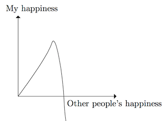
I was wondering why exactly it is that I get anxious and sad when the people around me are extremely happy. This seems contradictory. When people around me are sad, I get sad; when people around me are happy – but within reason – I get happy. It’s only when we get into the extremely happy territory that my happiness drops. So it looks like this:
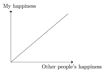
when it should look like this:
Let’s isolate the problem:
I can be around small groups of extremely excited, happy, loud people and enjoy myself. I’ll laugh and feel part of the group, but I won’t participate in being loud and visibly enthusiastic.
At the Community Weekend, where were situations where I was feeling sad and anxious, and this feeling was made worse when we were gathered as a big group, and people calmly explained how happy they were about the event. I did not feel part of the group.
At the end of the first meeting of my productivity-/accountability-group, it was decided that we would do a group cheer at the end. It was a group of roughly five people and I had felt very integrated into the group up until that point. When it was time for the group cheer, I felt like an outsider and got anxious and experienced a sadness spiral for the rest of the night.
I was once at a concert I liked. At concerts, everyone shouts along with the band (this was a metal concert). I tried – and I couldn’t. I knew nobody would really hear me, or pay much attention to me. It was really loud. But still, I was completely unable to shout, and it wasn’t a physiological problem – the issue was in my head.
Relatedly: I would never even dream of screaming on a roller coaster. Not just because I couldn’t, but because it never even occurred to me to do that. I was always confused why people screamed – were they afraid? Didn’t they know roller coasters are safe? I’m not a person who screams.
In my life, there have been approximately three times where I got so angry that I actually did shout at someone.
Sometimes I get stressed out (mostly because of homework) and want to scream in frustration. Even if I’m the only person in the building, I can’t, and when I try, I feel trapped, because I can’t find a release for my emotions.
I’ve tried acting in the past, and I experienced the same mental block whenever I tried to play a role that wasn’t me.
The interpretation of this that currently feels most right to me has two parts. One, being loud, excited, enthusiastic, isn’t me, therefore, trying to pretend that I am these things feels inauthentic and wrong. Two, not being able to participate in group behavior when (a) it is expected, and (b) I want to, makes me feel excluded. So the feeling is, group cheers is not something Nino does; group cheers are something members of this group do; therefore, I do not belong to this group.
I remember different situations where I deliberately played a specific role in order to nudge my identity in a certain direction. For example, before I started my TA job, I was Not A Person Whose Job Involves Leading A Group Of People. Deciding to change that was uncomfortable and anxiety-inducing. A person who could do a job like that was not who I was, but it was who I wanted to be. So I forced myself into the role and, knowing that I would be easier not to do this alone, I had someone sit beside me as I sent out the email asking for the job. Once I’d done that, I’d become a person who can, at least, ask for such a job. Once I’d experienced doing a thing a person like that would do, actually showing up to sign the contract and then going to the classes was much easier because I could just let subconscious consistency effects play out. “Well, I did ask for this job. If I’m the kind of person who asks for a job like this, that must be because I think I can do it, and that must be because I probably actually can do this.”
I didn’t used to be the kind of person who enjoys dancing badly at parties. I’m still not 100% comfortable doing it, but ever since I put myself in a situation where I was forced to participate and was in a good mindset to accept that I was actually doing it instead of “I’m forcing myself to do something that is not Something I Do,” dancing has become much easier for me – so much that it can even be enjoyable.
So: I alieve that I’m not a person who can shout, or cheer, or be loud and excited about things. Therefore, getting into situations where this behavior is expected of me, will make me anxious. Knowing that, the solution seems relatively simple. I need to practice shouting, and cheering, and being loud and excited about things. I need to do this as long as it takes to become less painful and aversive. For this to be successful, I need to be in an environment that feels safe to me. My best guess for what that environment would look like is: a group of 2, 3, at most 4 people, including me, in a place where no strangers can easily hear loud noises. Being inside a regular apartment with neighbors above and below would make this considerably harder. Doing this on my own won’t work because I can’t make all the noise myself. Turning on loud music or sounds from the internet won’t work because the sounds need to be human made. As I mentioned, concerts won’t work because I don’t feel safe enough around the other audience members. Open spaces, outside, far away from any buildings would work well because you could start out by standing far apart and shouting things at the other person. Since, in that case, shouting would be necessary to transfer information, it wouldn’t feel as aversive. From there, you could slowly move closer together while keeping the volume high.
Once I’m more comfortable with shouting, we could move on to loudly displaying enthusiasm by saying, “Yay!” and “Woo!” and “Yes!” and “Victory!” really loudly, and waving your fists around and whatever people do.
I predict that, if I do this a few times, group enthusiasm will be significantly more bearable for me in the future, which would make lots of social interactions easier; and that would be extremely useful for my life in general.
I also predict that I’ll feel really really silly doing all of this. (Even more silly than I felt writing it.)
(Comment or email me if you want to be my shouting partner. This could be lots of fun.)
[Part 1 is about a feeling about the world. Epistemic state: Maybe I shouldn’t commit to writing blog posts about every thought that occurs to me while browsing Wikipedia. Part 2, part 3.]
I decided I don’t like the term “laws of physics” to describe the way reality behaves. Calling them laws makes them sound optional1. Like, it would be really good if you didn’t break them because they are being enforced by the space police, but if you’re really clever, you can outrun the space police and break them anyway. But you can’t.
When you put two marbles down, and then you add two more, the fact that there are now four marbles isn’t a law you can break. It’s not something where some universal authority decides that this should happen by calculating 2+2. It’s just the way things are.
And so, when you hit the accelerator, there is nothing deciding to stop you from going past the speed of light. It’s just not going to happen. Look, for example, at Conway’s Game of Life. Because of the way the game is structured, there is an absolute speed limit and there is nothing you can do to go faster than that maximum speed. And still, if you program a simulation of the Game of Life, you don’t need to add a rule preventing things from exceeding the maximum speed. Like two marbles plus two marbles being four marbles, the speed limit is just a consequence of the structure of the universe.
But! For the people in the Game of Life, it won’t be that obvious, because they don’t see the game board. They see the contents of the cells, but not the cells themselves. So they might wonder why the speed limit exists and they might think they can somehow circumvent it. It’s only when you see the game board that you get an intuitive understanding about why these laws exist and why it’s not forbidden to break them, but a logical impossibility.
This transfers to the real world, too. There have been people who tried to build perpetual motion machines and made plans to go faster than the speed of light and theorized about superluminal neutrinos. Thinking about the laws of the universe as something that logically follows from the stuff the universe runs on, rather than the laws being rules that exist explicitly and are somehow enforced, makes impossible things feel more impossible – you won’t trick the universe into giving you energy by building a perpetual motion machine that is so complicated that the space police doesn’t notice you’re stealing energy.
I thought that was an interesting intuition.
Footnotes
Weellll, this is arguably inaccurate, but the point is less about the terminology and more about the intuition, so whatev. ↩
There seems to be a distinct and relatively predictable pattern to my confidence/comfort levels when I’m meeting new people and I’m wondering whether this is a common experience.
Usually, before I get to know someone (except when they’re known for doing something really interesting), it’s hard to build an interest in them. Like, I can feel completely lonely and desperately want friends and still, when I think about who to talk to, just everyone new will seem like the dullest person in the world. So, if someone happens to talk to me, the stakes are low and I’m not anxious. After one or two conversations, I manage to internalize that I’m talking to an actual sentient being and I start becoming really excited about talking to them.
If it turns out they like me, and we stay in touch for a few days, there comes a point where my brain is like, “oh wow, this is turning into a thing. Are we friends now?” And then I notice I’ve told most of my backstory and I start running out of things to say. So I’m trying frantically to find things to say and it’s just not working and it’s like, “oh gods, do I have nothing interesting to say? How can I keep the other person from losing interest?” And I get anxiety attacks and the only thing that can help is them talking to me, but they don’t because they don’t have time to talk to me like all day which is what I’d need to feel safe, and I don’t know what to do.
Eventually – if contact doesn’t stop, that is – I realize it’s okay that I sometimes don’t have anything profound to say and I get into a groove of just speaking whenever I do have something to say. I feel more or less certain that the other person cares about me as a human being, and that I won’t mess that up by saying one wrong thing, so I manage to relax and I get less anxious.
But then I realize – wait, I’m much more confident now than I was in the beginning! Maybe they only liked the shy me, or they only liked me because they didn’t get the full picture because in the beginning I was all quiet and agreeable. So I get more anxious again, and I get quieter. But then I feel like I’m holding myself back and I’m boring because I never say anything so I still try to be confident and say things and be courageous and settle into kind of a back-and-forth of being more vocal vs being more agreeable.
And after a while I get used to that and I feel better saying things. And eventually, after years and years and more sudden dips in my courage, the connection turns into a stable friendship and I don’t need to be so scared of sending them cute cat pictures anymore.
Does anyone else have a similar experience, or is it more common for confidence levels to rise linearly with time, or something else?
[Kinda sappy and emotional in parts. Being posted sort of a long time after the event. Not totally happy with the way this post turned out, but, you know, better finished and mediocre than perfect and imaginary, or something. Epistemic state: I deleted a lot of “as far as I can tell”s. Just pretend like every sentence ends with those words, and please do tell me if I’m wrong about anything.]
I attended this year’s European LessWrong Community Weekend. The initial draft of this post began thus:
This is the event report I did not want to write and you do not want to read.
I decided I didn’t like this approach. During the Weekend, people always said, “make it your own.” So let’s do that instead.
This is a collection of things I learned while I was in Berlin.
In the weeks leading up to the Weekend, I was really excited. This was going to be awesome. I would meet new people and have fun talking to them, and maybe even make a few friends. I thought, “I enjoy being in the Study Hall most of the time, how hard could meeting people in the real world possibly be?”
Quite hard, as it turns out. Being around so many people in the real world was completely overwhelming for me and I spent large chunks of the Weekend feeling anxious, depressed, and worthless. I wanted to talk to people, I wanted to socialize, I wanted to have a nice time, but the more I tried, the more I felt like I was failing. I thought I would quite possibly never be able to make any new friends because I was just no good at it.
That was how I felt on the way back from Berlin. But the fact was that everyone at the event had been incredibly friendly and welcoming and the only reason I felt like I hadn’t connected with anyone was because I was being all scared. I decided it would be incredibly unfair to the other participants to let sadness, self-loathing, and resignation be the bottom line I’d draw from this experience.
I needed a mindset-shift. I needed to get into a more positive reference frame. Partly inspired by Robert’s lightning talk on gratitude journaling, I began by making a list of everyone I remembered having a comfortable conversation with. It took me only a few minutes to gather about 20 names, which I thought was pretty good for an event with less than 80 people – especially considering I spent a lot of the time hiding from everyone.
As a result of this exercise, it became much easier to contemplate all the positive aspects of the Weekend and feel a lot better about having attended.
Create opportunities, not conversations
So the plan was to meet new people and form new relationships and socialize and all that business, right? Yeah. But there’s a problem: I don’t actually know how to do that. I know I try, and I know that sometimes I manage to have a good time talking to people. But – and I really should have noticed this earlier – I’m always surprised whenever I have an enjoyable social interaction. So I knew I wasn’t actually incapable of having nice conversations – because they’ve happened before – but I was clearly doing something wrong; somehow, my model of how successful social interactions work must be flawed. Ironically, I could never remember what I’d done when conversations did go well. Whenever I really made an effort and thought about what I was doing, things were awkward and uncomfortable. How would I ever make progress like that?
And it took me this long to notice it. Maybe that is not a coincidence. Maybe trying to socialize just won’t work because socializing is not an action and “trying to socialize” actually does nothing but distract me from doing the actions that lead to everyone having a nice time. Assuming this is true, what are the actions I can perform?
Whenever I find someone interesting, I tend to assume they are somehow “objectively” interesting, so talking to them must be a bad idea because everyone is probably already talking to them all the time and I’ll just be an annoyance. Lesson One: This is not true. In most cases, your interest in someone is primarily a fact about you, and not the interesting person. If you don’t know how to start a conversation, just look for a group of interesting-looking people and stand close to them. What do you do then? You wait. Wait and listen. Don’t think about what to say. Trying to think of something to say is pretty much the last thing you ever want to do when you’re trying to have an interesting conversation (unless you have something specific you want to tell the other person, that is). Thinking about what you might say next will only distract you from listening to what the other person is saying.
So you wait, and you listen, and you try to get a feel for the situation. When you’re not desperately trying to “socialize” or “talk to people”, your brain won’t tell you you’re failing when you don’t say anything for a while. This will give you the time to get comfortable which, in turn, will tell your brain it’s okay to relax. And that is the point where you start talking, because once you feel relaxed and comfortable and you’re listening, you will inevitably find relevant things to say. (If you do find something to say earlier, you don’t need to hold back, of course. This is just supposed to help you think when you can’t.)
When I’m with a group of people I don’t know well, and the group moves from one place to another, I tend to get insecure and not know whether they still want me there, so I often quietly disappear. Lesson Two: The event is called “Community Weekend” for a reason. The others are there to talk to people, too. It will probably be fine to stay with a group and take part in their conversations even when they change locations. If you’re worried about being annoying, keep in mind that it is actually quite difficult to be so annoying that people will want you to go away. And if that doesn’t help, just have some faith that people will tell you to leave if they really don’t like you.
I have some ideas for one-on-one conversations with a specific person, but it’ll take a bit more practice until I can turn them into something useful.
I go into social encounters viewing most people as a combination of scary and boring. I can sometimes overcome that most of the way by spending months getting to know them and appreciate their unique perspective. Or I can cuddle with them for ten minutes. Either one works.
Ever since I read this, it has been part of my identity. Now I’m not so sure. I still think cuddling is awesome and it can calm me when I’m stressed out, but it did not really make me feel more comfortable around people I didn’t know and was scared of. Apparently, for me, to feel good about cuddles, I need some kind of relationship to be already present, or it will feel uncomfortable for me. Fortunately though, depending on the person, it doesn’t take more than a few minutes of contact to get to point where I feel comfortable cuddling someone. (I’m referring here to the stuff that’s been going on in the Blanket Fort. Regular everyday hugs work all the time with everyone, and I got quite a few of those at the Weekend for which I am very grateful.)
Blanket forts are awesome
Seriously, it’s like a blend between engineering and cuddles.
People know I exist
I once had a conversation with a friend from university. She is the person who (I assume) knows the names of (almost) every other physics student two semesters up and down at my university. To me, she said, “until well into the second semester, I didn’t even know you existed.” And the thing is: That did not surprise me. I’m not a very conspicuous person. Being mostly quiet and if not, uncontroversial, it’s understandable if people don’t notice me much.1
In the Study Hall, as far as I could tell, I’ve mostly been quiet, too, so I figured regulars of the Study Hall who were also attendants at the Community Weekend would be vaguely aware of my existence, but nothing more. It surprised me how much I felt like the other people from the Study Hall felt like they knew me. And then later in the Weekend, a few people even told me they liked talking to me and want to do more of that! Whaaat.
After thinking about this for a while, I concluded that this realization can be generalized to “people seem to feel more connected to other people (including me) than I feel to them”. Knowing that my perception of closeness is apparently different from most other people’s is useful, because (a) now I have something more specific to work on (I can probably worry less about making people like me and spend more time building trust that they already do), and (b) I can be slightly more confident in friendly interactions because I can assume that people probably dislike me significantly less than I might intuitively feel they do.
Someone suggested that this asymmetry may be caused by the fact that I tend to be very open and sharing about my feelings and insecurities and vulnerabilities, which makes people feel more connected to me, while I’m not as good at getting people to open up to me, which makes me feel less connected to them. I have observed that I do tend to sacrifice asking people about themselves in favor of oversharing my own experiences, so this is something else I want to work on.
Purpose, authority, and confidence
As I mentioned, one of my goals for the Weekend was meeting new people and, as I mentioned, I was having a lot of difficulty with that. This made me feel out of place and really useless a lot of the time. Then I saw people who were very distinctly not useless: the organizers were running around, doing important organizing. They didn’t need to worry about fuzzily defined personal goals because they had a clear purpose to fulfill. I imagine that having a purpose like that would have made me feel better. Toward the end of the Weekend, for example, I helped a bit with the clean-up, and that was significantly more comfortable (and confident) than sitting around, not knowing what to do. I decided that, if I’m going to attend the next Community Weekend, I would like to help organize the event. (I haven’t talked about this with this year’s organizers yet, and unfortunately I currently don’t actually know whether I can attend next year.)
You can meditate lying down
During the awesome amazing fantastic incredible Games Of Entropy reading, Daniel mentioned he likes to meditate lying down. I’d been struggling with keeping up my (theoretically) daily meditation because often I was tired and just wanted to take a nap instead. If I’m lying down, I realized, it’s like the perfect blend between a nap and meditation. Afterwards I am both physically rested and emotionally more stable, and the odds that I will actually do the meditation on a given day are significantly higher now.
Conclusion
I may be overly optimistic here, but I get the impression that, with the right approach, there is a lot of low-hanging fruit for increasing my comfort levels in social settings, and I even feel motivated to talk to more people to practice. I have already had a few interesting conversations with people I met at the Weekend and it seems likely that there will be more of those in the future. So, while my happiness-value spent a sizeable portion of the event below zero, I don’t regret having attended and I’m extremely grateful to Anne for suggesting it.2
Footnotes
This sounds so much like self-pity, but I don’t mean it that way, I promise! I’m just trying to describe a perfectly factual situation that consists of nothing but true facts. ↩
Before, my plan had been to see how my life develops and then possibly attend the 2016 LWCW. ↩