Big numbers, small numbers
You don’t want things to be complicated. I get it. I am here to help. Don’t worry, it’s all going to be over soon.
Contents
Preamble – skip this section if you don’t care
Having numbers and letters in the same text is a difficult challenge for typography:
Arabic numerals have a completely different origin, and thus completely different shapes than roman letters.
If you just somehow throw them in the middle of your text, the numbers will look out of place.
But (let’s pretend) you want them to look like they fit in.
You don’t want your numbers to show up at their friend’s party and someone walks up to you them and is like, “So how do you know the host?”, and you’re the numbers are like, “I study physics with them,” “We come from the other end of the world,” and the person is like, “Haha yeah, I figured, from the way you look.”
Because that would be embarrassing.
So the typography friends all sat down together and adapted numbers to look more like letters. Since there are two kinds of letters, they made two kinds of numbers. One kind to go well with upper case letters, for titles and tables, and one to go well with lower case letters, for body text. They are called by many names, but we’ll call them upper case and lower case numbers. Using upper case numbers in the middle of body text has the same effect as using ALL CAPS in the middle of body text: it makes the number seem damn important. That’s fine if the number is damn important, but most numbers are not.
Quick historical interlude from Robert Bringhurst’s The elements of typographic style:
During most of the nineteenth and twentieth centuries, lining figures were more widely known as ‘modern’ and text figures as ‘old-style.’ Modernism was preached as a sacred duty, and numbers, in a sense, were actually deified. Modernism is nothing if not complex, but its gospel was radical simplicity. Many efforts were made to reduce the Latin alphabet back to a single case. (The telegraph and teletype, with their unicameral alphabets, are also products of that time.) These efforts failed to make much headway where letters were concerned. With numbers, the campaign had considerable success. Typewriters soon came to have letters in both upper and lower case but numbers in upper case alone. And from typewriters come computer keyboards.
Typographic civilization seems, nonetheless, determined to proceed. Text figures are again a normal part of type design – and have thus been retroactively supplied for faces that were earlier denied them. However common it may be, the use of titling figures in running text is illiterate: it spurns the truth of letters.
Ok, let’s continue.
Unfortunately, uppercase numbers aren’t always bad. Especially the scientifically minded will often wish to have big tables of numbers, and the contents of tables are supposed to look nice and regular – “tabular”, you might say. In this case, it makes sense to take advantage of the uniform, blocky shapes of upper case numbers to make everything line up neatly. As a result, we’d want lower case numbers for text, and upper case numbers for tables.
Buuuuuuut, because fonts and the web and everything are complicated and we can be glad to even occasionally get half-decent fonts on the web at all, this is too much to ask. Instead, let’s see if we can find a middle ground where everyone is only sorta unhappy.
The solution – read this part
From what we’ve learned in the last section, if you ever want to have a table with numbers in your text, using lowercase numbers is kind of a nonstarter. Instead, we’re aiming for uppercase numbers that are less awful.
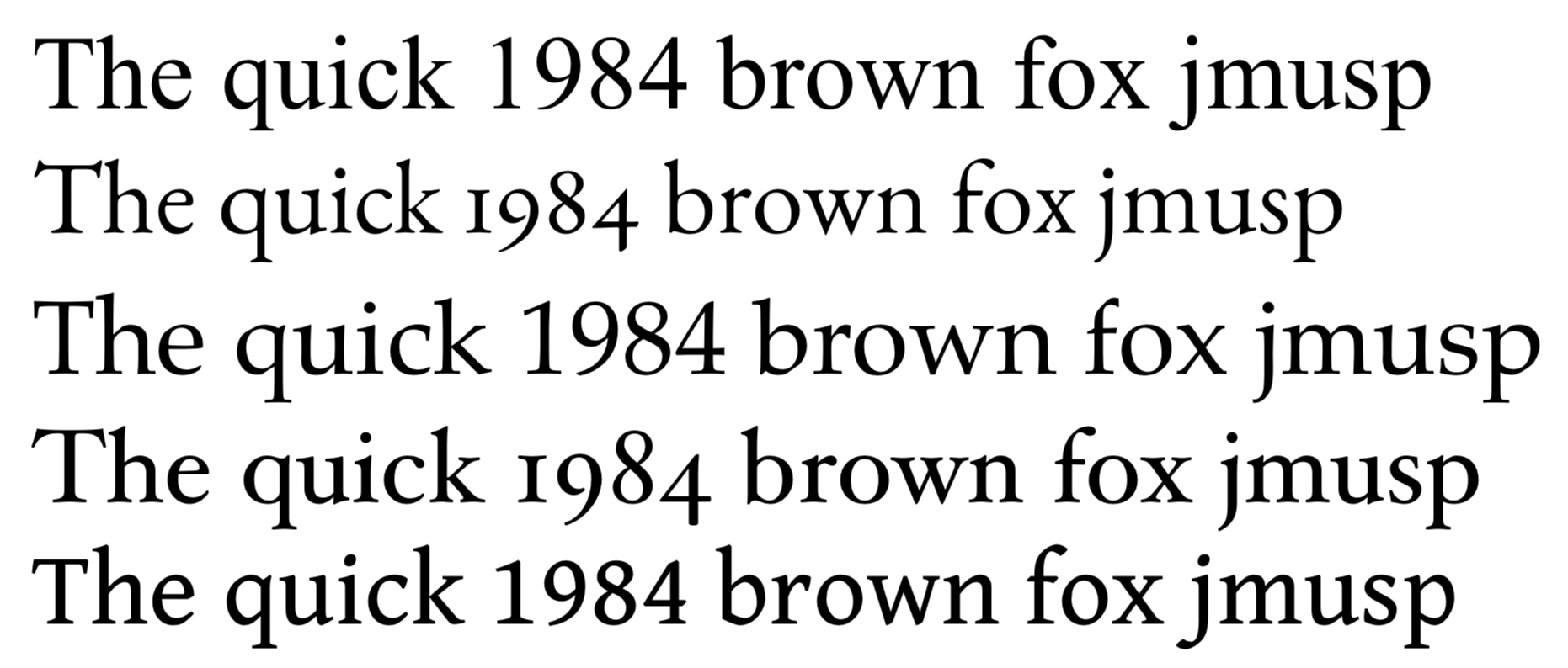
Let’s look at some fonts:
 {:.right.half}
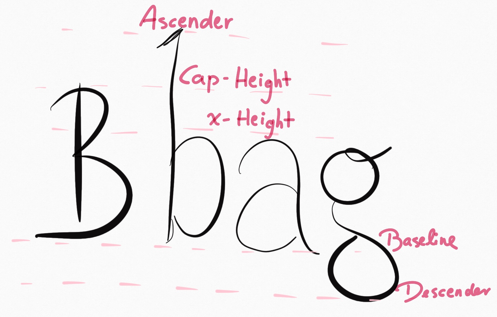
In the first and third line (Times New Roman, Palatino), the problem is clearly visible: the numbers are absolutely gigantic and distract from the text. In the second and fourth line (EB Garamond, Hoefler Text), lowercase numbers emulate the dynamics of the text and thus blend in better. In the fifth line (Gentium Book), the numbers are upper case and thus usable for tables and titles, but they aren’t obnoxiously huge. Now, the makers of Gentium did not just scale down the numbers and call it a day. Instead, they lowered the entire cap height (see picture on the right or possibly above). This is especially visible in the “The” at the beginning of the line; the “T” is much shorter than the “h”. As a result, lowercase letters can retain their ascender height and don’t look squished, and numbers (which have cap-height) aren’t obnoxious. On top of that, you get the positive side effect of having nice-looking acronyms without needing small-caps, which has been another source of constant frustration for me.
I first saw this technique in the font FiveThirtyEight use:
By the nature of their content, they need a lot of numbers and acronyms, while still wanting to maintain a generally nice-looking page. Their font solves this problem wonderfully.
In conclusion: If you want good looking text and not worry about things and not bother with small numbers, find a font with a small cap-height and/or large x-height, and ideally with long-enough ascenders that it doesn’t look all cheap and squished. If you’re unsure, just use Gentium Book – that one’s in Google Docs, looks cool, and has all kinds of non-latin accents and stuff too.