3 May 2024
142 words
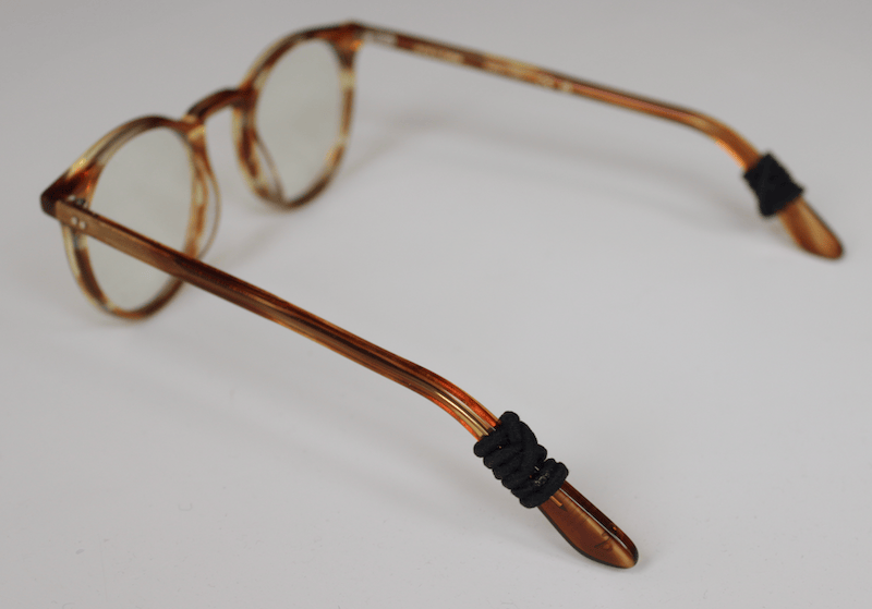
For some reason, my glasses really don’t like staying on my face. Since this is especially bad when I’m sweating, I wanted to figure out a way to improve the situation before the summer. It looks like wrapping a hair tie around each temple, just behind the place that rests on the ear, might help keep the glasses in place a bit more.
So far this seems to work for me, and it doesn’t feel like it adds too much pressure on my head. One drawback is that now my glasses sometimes come off when I take off my headphones, but that is probably overall still better than constantly fighting the glasses.
14 December 2023
Modified: 27 March 2024
315 words
I really don’t like Python1, but I have to use it for work, and so I have set myself the goal of learning to appreciate it. This is a list of mostly objective claims about Python that I appreciate. Submissions are welcome, but I’ll only add them if I agree that they’re basically objectively true.
- Python starts up in less than 0.1s, so it can be used for short scripts.
- I guess it is more readable than APL or Cobol.
- You can FFI into
better other languages relatively easily.
- It has a more complete standard library than OCaml or C.
- Package management is easier than it used to be, I think.
- It has lots of libraries.
- Some apps (e.g., Blender) use Python for scripting, so knowing Python will help there.
- It has official Qt bindings, so should be one of the easier language-choices for making little GUIs.
- Type annotations + Pyright is better than nothing.
- This is not really an objective thing, but I appreciate the fact that the
culture has agreed to import whole namespaces (e.g.
import pandas as pd,
import numpy as np), so you can always tell where a function or class is
coming from (e.g. pd.DataFrame, etc). This also probably helps avoid using
“private” APIs: if the top of my file says from whatever import _hello, a
thousand lines further down, it won’t look out of place to call _hello()
(“maybe it’s just a private helper function defined in this file!”). But if
you do import whatever, you’ll have to write whatever._hello(), which will
stick out like a marginally sore thumb.
zip is a built-in function.
I’ll add more points as I think of them.
4 September 2023
Modified: 2 February 2025
247 words
You’ve heard me complain about how, while people will tell you that “the Germans
have a word for that”, German actually has too few words, and one thing that
makes English so beautiful is its rich vocabulary.
(If you haven’t heard me rant about it, all of those “the Germans have a word
for that” words are just compound words that work just as well in English –
German just makes things confusing by leaving out the spaces or hyphens. (E.g.,
“Schadenfreude” is just “damage-joy”. It sounds weird in English, but that’s
just because it’s not established as a common phrase.) This compound-word game
can be a lot of fun at parties, but it doesn’t help you when you realize German
doesn’t really have different words for “proof” and “evidence”.)
So, after two paragraphs of preamble, here’s the list (at the time of writing,
this list has only two items, but I may extend it over the years):
- “schmatzen” (verb). This word refers either to the act of chewing with your
mouth open, or mouth sounds that sound like it. E.g., your cat might pounce
on your chest and wake you up with schmatz sounds, even though he’s not
actually eating at the time.
- “lutschen” (verb). To lick or suck on something that is predominantly or
entirely in one’s mouth, e.g. a bon-bon, lollipop, or dick.
- “zerspielt” (adjective?). When you’ve destroyed something by playing with it
too vigorously. (added 2 Feb 2025, h/t Anne)
17 January 2020
333 words
The option key in macOS should be called alt like on Windows, because it is used to type alternative characters, or to run alternative commands when used in conjunction with the command key. On Windows, the alt key should be called command because you use it to move focus to the menus to execute commands. The alt gr key on Windows should become the alt key because that’s what you use to type alternative characters. The shift key should be called caps because nobody has used a typewriter in decades, and nothing is being shifted anymore. (The name isn’t perfect because you also use that key to type alternative symbols on the number row, but we already have an alt key. Maybe we could use our new alt key to type all the symbols from the number row and the number keys can produce old-style figures without caps and lining figures with – though that would require changes to unicode, so that might be out of scope for this project.) The caps lock key should be dropped entirely and replaced with an escape key that functions as ctrl or command when held down, according to user preferences. On keyboards that have one, the fn key should be renamed to something like alt-ctrl because it’s usually like a ctrl or command key, but it does different things. Maybe special would work, as a nod to the old “Special” menu in Classic Mac OS.
And while we’re renaming keys, the tab key should be renamed to shift because we make tables using the “Insert table” command, not by pressing the tab key. The tab key is used to shift text to the right, or to shift focus to the next input element. (On the other hand, ctrl + tab is used to navigate between browser tabs, but that’s one bit of elegance we can probably do without. (You can still say you’re “shifting” focus to the next browser tab, so it all works out in the end.))
3 September 2019
542 words
Fun things I discovered about my muscle memory.
1. Other people’s computers
For the last 5–10 years, I’ve been using the Dvorak keyboard layout for typing.1 At this point, I’m pretty fast and usually don’t make a ton of mistakes. Since I almost never2 use a QWERTY layout,3 I’ve gotten really slow with it. So, when I’m helping a coworker with a problem, I’ll sometimes switch their keyboard to a Dvorak layout and try to type normally. But my hands will often think, this keyboard feels different; it must be another person’s keyboard; other people use the QWERTY layout, and so I keep typing words as though I were using a QWERTY layout, resulting in a big jumble of random letters. Or maybe it’s not necessarily that the keyboard feels different, and more that I know I’m using another person’s computer. Because when I plug a new keyboard into my own computer, I can usually use Dvorak without a problem.
2. Proprioception4
I have two mechanical keyboards. At work, I use a keyboard with an ergonomic split-layout. At home, I use a tiny keyboard with slightly more traditional key layout. I can type reasonably fast on either of them. However, when I bring my home-keyboard into the office, my hands will just feel a mechanical keyboard, and since I am in the office, they assume I’m using the split keyboard, and keep trying to use it as such. When I tell my hands to insert a new line, suddenly my thumb will press the “Upper layer” button, because that’s where the enter key is on the split keyboard. This does not happen when I use the tiny keyboard at home, so, somehow, my hands can figure out whether I’m in the office or not.