❀✿❀ SuperLaserNino ✿❀✿

Big numbers, small numbers

15 March 2017

Modified: 15 March 2017

959 words

You don’t want things to be complicated. I get it. I am here to help. Don’t worry, it’s all going to be over soon.

Contents

Preamble – skip this section if you don’t care

Having numbers and letters in the same text is a difficult challenge for typography: Arabic numerals have a completely different origin, and thus completely different shapes than roman letters. If you just somehow throw them in the middle of your text, the numbers will look out of place. But (let’s pretend) you want them to look like they fit in. You don’t want your numbers to show up at their friend’s party and someone walks up to you them and is like, “So how do you know the host?”, and you’re the numbers are like, “I study physics with them,” “We come from the other end of the world,” and the person is like, “Haha yeah, I figured, from the way you look.” Because that would be embarrassing.

So the typography friends all sat down together and adapted numbers to look more like letters. Since there are two kinds of letters, they made two kinds of numbers. One kind to go well with upper case letters, for titles and tables, and one to go well with lower case letters, for body text. They are called by many names, but we’ll call them upper case and lower case numbers. Using upper case numbers in the middle of body text has the same effect as using ALL CAPS in the middle of body text: it makes the number seem damn important. That’s fine if the number is damn important, but most numbers are not.

Quick historical interlude from Robert Bringhurst’s The elements of typographic style:

During most of the nineteenth and twentieth centuries, lining figures were more widely known as ‘modern’ and text figures as ‘old-style.’ Modernism was preached as a sacred duty, and numbers, in a sense, were actually deified. Modernism is nothing if not complex, but its gospel was radical simplicity. Many efforts were made to reduce the Latin alphabet back to a single case. (The telegraph and teletype, with their unicameral alphabets, are also products of that time.) These efforts failed to make much headway where letters were concerned. With numbers, the campaign had considerable success. Typewriters soon came to have letters in both upper and lower case but numbers in upper case alone. And from typewriters come computer keyboards.

Typographic civilization seems, nonetheless, determined to proceed. Text figures are again a normal part of type design – and have thus been retroactively supplied for faces that were earlier denied them. However common it may be, the use of titling figures in running text is illiterate: it spurns the truth of letters.

Ok, let’s continue.

Unfortunately, uppercase numbers aren’t always bad. Especially the scientifically minded will often wish to have big tables of numbers, and the contents of tables are supposed to look nice and regular – “tabular”, you might say. In this case, it makes sense to take advantage of the uniform, blocky shapes of upper case numbers to make everything line up neatly. As a result, we’d want lower case numbers for text, and upper case numbers for tables.

Buuuuuuut, because fonts and the web and everything are complicated and we can be glad to even occasionally get half-decent fonts on the web at all, this is too much to ask. Instead, let’s see if we can find a middle ground where everyone is only sorta unhappy.

The solution – read this part

From what we’ve learned in the last section, if you ever want to have a table with numbers in your text, using lowercase numbers is kind of a nonstarter. Instead, we’re aiming for uppercase numbers that are less awful.

Let’s look at some fonts:

A selection of fonts, demonstrating how they handle numbers
A number and a typo. From top to bottom: Times, EB Garamond, Palatino, Hoefler Text, Gentium Book.

Different heights that exist in fonts {:.right.half}

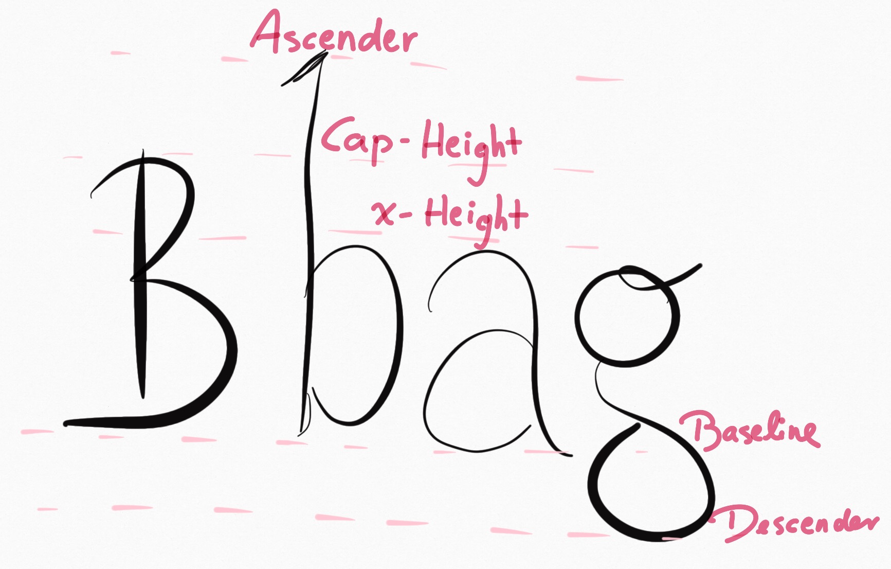
In the first and third line (Times New Roman, Palatino), the problem is clearly visible: the numbers are absolutely gigantic and distract from the text. In the second and fourth line (EB Garamond, Hoefler Text), lowercase numbers emulate the dynamics of the text and thus blend in better. In the fifth line (Gentium Book), the numbers are upper case and thus usable for tables and titles, but they aren’t obnoxiously huge. Now, the makers of Gentium did not just scale down the numbers and call it a day. Instead, they lowered the entire cap height (see picture on the right or possibly above). This is especially visible in the “The” at the beginning of the line; the “T” is much shorter than the “h”. As a result, lowercase letters can retain their ascender height and don’t look squished, and numbers (which have cap-height) aren’t obnoxious. On top of that, you get the positive side effect of having nice-looking acronyms without needing small-caps, which has been another source of constant frustration for me.

I first saw this technique in the font FiveThirtyEight use:

FiveThirtyEight sample

By the nature of their content, they need a lot of numbers and acronyms, while still wanting to maintain a generally nice-looking page. Their font solves this problem wonderfully.

In conclusion: If you want good looking text and not worry about things and not bother with small numbers, find a font with a small cap-height and/or large x-height, and ideally with long-enough ascenders that it doesn’t look all cheap and squished. If you’re unsure, just use Gentium Book – that one’s in Google Docs, looks cool, and has all kinds of non-latin accents and stuff too.

Willpower day

8 March 2017

824 words

Background

I noticed I wasn’t happy with the way I spend my time. Over the last year or so I learned to structure my work habits such that I need the least amount of willpower possible to get myself to work. I tried hard to get myself to do things without requiring willpower and, in the process, built somewhat of an aversion to do anything that seemed like it might require effort. For the most part, this was good: I learned to notice moments when I just didn’t have the mental capacity to do work, and so learned not to judge myself for sometimes not working and instead looking at comics on the internet.

On the flip-side, I have become dissatisfied with the amount of challenging activities I do in my non-work time. Too often, I spend my after-work time doing only effortless things, neglecting my desire to do low-but-finite-effort activities like reading, writing1, or even just tidying up the apartment for a few minutes.

It’s not that I never do anything useful with my time, but I feel like I could increase the quality-density of my time by making more of an effort. Additionally, maybe spending a bit of willpower will allow me to build a habit of taking fewer (or shorter) breaks and, generally, living (at least somewhat) faster.

The experiment

So I decided to do an experiment: For one day, I spend as much willpower as I can to combat my usual slowness and aversion to effortful tasks. On the object level, this meant roughly three things:

  1. When I’m taking time to relax, instead of watching cat videos, I’ll read things, take notes, etc.
  2. Whenever I’m feeling like I just want to take a break and not do anything, I’ll go against that urge and work anyway. The reasoning behind this is that, if it turns out I can’t focus in the moment, I can still stop working. But at least I don’t run the risk of underestimating my ability to work.
  3. I resist the urge to put tasks off if I can easily do them immediately.

The result

Overall, the results of this experiment are surprisingly unspectacular.

Getting up in the morning wasn’t a problem since I had an early call that I was looking forward to. After that, I tried, just for fun, to step into the shower before the water was at the right temperature. That worked … so … yay.

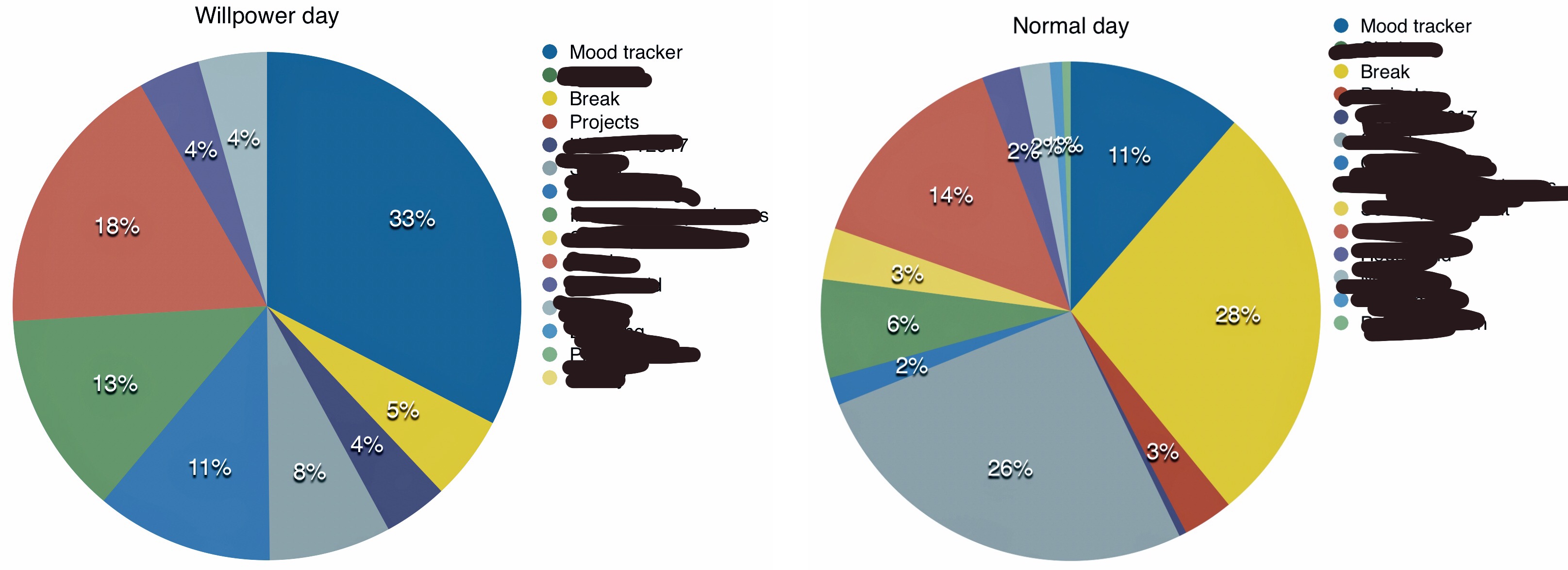
Looking at the way I spent my time during the day, it seems like noticing when I’m doing nothing, and then doing something instead, is a good idea:

Pie chart showing the distribution of activities on an average day, compared to willpower day
Time tracking results on an average day compared to Willpower Day. Making charts from spreadsheets is really difficult.

I spent significantly more time working and less time doing “break” than on the average day.

What makes the experiment so unspectacular is that it turned out there were actually not that many situations where I could really change anything using willpower. I could will myself to go in the cold shower, sure, and I can will myself to read a bit more, but when I can’t think because my brain is all used up, there is nothing I can do about that. There are some emails I can will myself to write faster, but when I’m faced with a mental block because of anxiety or descision fatigue, what I really need is L-theanine, not more stress.

The final unsurprising finding is that I got extremely tired and needed to sleep for 10½ hours after the day, plus a 90-minute nap during the day. Wow. That’s 12 hours total! Okay, let’s start this paragraph over.

As a final finding, I was quite surprised with how much extra sleep my body required just from trying to work a little more. I already need a lot of sleep, but 12 hours is a bit more than I’m happy to accept. Two caveats to the surprise:

  1. Since I had an early morning call I slept only 7½ hours the previous night, which is a bit less than my average.
  2. I just today realized that there is no more caffeinated coffee in this house and I may just have been feeling strangely tired during the day because I was drinking decaf without realizing it.2

In conclusion

Using a bit more willpower seems good. Having regular designated willpower days may be good practice to get into the habit of being strong of will. Don’t overdo it though.

Footnotes

  1. Calling writing “low-effort” is a bit of a stretch, but taking some notes shouldn’t be impossible.

  2. This is pretty cool, too, because I’ve now spent 2 or 3 days without caffeine, which means the worst of the withdrawal headaches should be gone soon and I get a caffeine-addiction-reset.

Inconsolata LGC with oldstyle numerals

18 December 2016

81 words

In my perennial quest to make everyone love oldstyle numerals, I decided to make a fork of one of my favorite programming fonts, Inconsolata, and give it oldstyle numerals.

The numbers 0 through 9 set in Inconsolata LGC using oldstyle numerals
This is what it looks like

The font can be downloaded from GitHub.

If I figure out how to properly use FontForge, I’ll also add programming ligatures at some point.

Focusing on the breath

15 November 2016

225 words

During mindfulness meditation, you’re supposed to focus on your breath. If you encounter any stray thoughts, you’re instructed to notice them and let them pass by, always returning your focus to the breath. I often find it difficult to stay focused on my breath for an extended length of time; it’s easy to start focusing on the breath, but after a short while, I’ll notice I’ve drifted off to thinking about something completely different.

I recently realized that, since it’s easy to shift my focus instead of holding it, it is much easier to focus on one breath at a time. Then, when the breath is over, instead of trying to keep focused, I’d repeat the mental motion of shifting my focus to the breath – again, only for a single breath. This way, I’ve been able to stay focused on my breathing for many minutes without drifting off into other thoughts.

So, in general, this is good, but it also feels like cheating since I’m not actually holding the focus; instead I’m doing a new mental motion after every single breath, which might put me in a less calm state than I’d be in if I could just learn to stay focused. I’d be curious to hear from people who have more experience with meditation, whether this is a bad way of doing things.

Four or five thoughts on scientific writing

18 August 2016

2565 words

A few days ago I handed in my bachelor’s thesis in physics and I had a few thoughts while writing it. Some of these thoughts only apply to literature that features a lot of mathematical equations, but some apply to all academic writing, or all writing in general.

“Cite before you write” is difficult

I have the impression that a common mistake for undergrads writing their first scientific paper is that they start writing and only insert citations later. This takes a lot of time because they have to go through the whole text and remember where they read each argument they mention. Additionally, it leads to worse quality citations because many students will get lazy and only insert citations until their supervisors stop complaining.

Like anyone who thinks they’re smart, I figured I wouldn’t make this mistake when I’m writing my bachelor’s thesis. But there I was, multiple pages written, a rough outline of the entire document finished, and I still had approximately zero citations in the text.

This surprised me because, whenever I research a topic online and take notes about it for myself, I never fail to cite sources. I gather links to sources, put them at the bottom of a markdown file, and write my notes around those links.

Why did I do it wrong in the context of my thesis? The problem wasn’t that I didn’t know citing as I write would be a good idea – I’d explicitly planned to do it. My best guess is that there was too much friction in the process. In the markdown example, all I have to do is copy the link to the source, paste it into the document, and put some identifier for the link at the beginning of the line (e.g. [example]: http://example.com "Optional title"). To get a proper citation into BibTeX, I have to find the paper on Google Scholar, click “Cite”, click “BibTeX”, copy the content of the entry, open the bibliography file, paste it in, change the identifier if it looks gross, go back to my document, and enter \cite{identifier}. It’s no surprise that people get lazy if that’s what they have to do for each source.

A solution to this problem is using citation management applications. There is, for example, Zotero, which can store all your papers in a handy library. It even gives you a button for your browser to quickly add new references without digging through cite-menus on Google Scholar. Using such an app, you just add every paper you look at into your library and, from there, export your bibliography file. Then you can copy or drag the citations from your Zotero library without having to think about the details.

I find it surprising that I hadn’t heard much or thought about them until a few weeks before my deadline.

On formal tone

I was surprised to see how much the tone of scientific papers differs from that of textbooks. So far I’d only ever read textbooks, and a lot of why I was excited to write my bachelor’s thesis was that I liked the styles of some textbooks. Authors like David Griffiths or David Halliday1 write in a way that is both whimsical and easy to understand.

Here are some fun examples:

Before leaving our review of the notion of temperature, we should dispel the popular misconception that high temperature necessarily means a lot of heat. People are usually amazed to learn that the electron temperature inside a fluorescent light bulb is about 20,000°K. “My, it doesn’t feel that hot!”2

I would be delinquent if I failed to mention the archaic nomenclature for atomic states, because all chemists and most physicists use it (and the people who make up the Graduate Record Exam love this kind of thing). For reasons known best to nineteenth century spectroscopists, l=0l=0 is called s (“sharp”), l=1l=1 is p (for “principal”), l=2l=2 is d (“diffuse”), and l=3l=3 is f (“fundamental”); after that I guess they ran out of imagination, because now it continues alphabetically (g, h, i, but skip j—just to be utterly perverse, k, l, etc.). The shells themselves are assigned equally arbitrary nicknames, starting (don’t ask me why) with K: The K shell is n=1n=1, the L shell is n=2n=2, M is n=3n=3, and so on (at least they’re in alphabetical order).3

And then I looked at articles and didn’t find a single joke in them! In fact the more papers I read, the more it felt like I was reading an entirely new language. Sentences are much longer than in non-academic writing. Most authors avoid using contractions (e.g. “can’t”, “isn’t”). Nobody puts any emotion into their writing, eliminating all traces of informality from the text. To say something “ran out” as in the second example above would probably already be too informal. It seems uncommon to add analogies to complicated explanations to make them intuitively easier to understand.

In a TED talk, linguist John McWhorter proposes that texting doesn’t harm teenagers’ writing skills because they subconsciously treat it like a form of speech rather than writing. Since writing a text message doesn’t feel like composing an essay, using lol and rofl won’t destroy the child’s ability to spell. I suspect that this compartmentalization of different means of communication is part of why formality is so important in academic writing: “Normal” written language can be imprecise but still easy to understand, if the reader and writer have shared background knowledge. Academic papers usually communicate complicated ideas where precision is important. It’s not hard to imagine that funny metaphors can easily lead to misunderstandings. So, while I don’t see how contractions would cause any problems on their own, the rule “be careful with funny metaphores” is harder to follow than “nothing even remotely informal ever”. If following either rule will lead to a well-argued paper, the latter is more efficient. Similarly, if it’s forbidden to write in terms of analogies, it’ll be easier not to be tempted to think in terms of bad analogies.

So simply writing in a way that feels very formal and fancy is a good way to make sure one’s writing stays precise without having to think about it too much.

But (1), on the other hand, “regular language” is a good tool for communication, too. We’ve all been trained to speak and write from very early on, and if you’re forced to write an basically a different language, it can slow down your thoughts and make you less efficient. Contractions aren’t “formal”, but they can make sentences more fluent and easy-to-parse. And analogies can offer valuable support for complicated explanations to steer the reader’s mind in the right direction such that they have an easier time following the text.

But (2), using formal language is not a fool-proof way to make sure all of your thinking is precise. I recently read a paper that contained the sentence, “At the inner boundary there are basically two types of reasonable boundary conditions: …” Saying words like “basically”, or “essentially”, or “reasonable” may sound fancy, but doesn’t actually explain anything.

But (3), using formal language can actually be harmful for clarity. You know how saying “I did X” sounds informal? A lot of the time, authors use “We did X” instead. This strikes me as a weird custom for papers that only have one author, but it’s still reasonably clear what the author means. It gets problematic when they start using the passive voice to sound fancy. Using the passive voice is almost always a bad idea. The reader needs to know who does what. “The stress tensor is given by …” Is that the definition? Does this follow from something? Are we assuming this? Using the passive voice is an easy way to accidentally leave out crucial information that the readers then have to figure out themselves.

Nobody ever quotes anything

I was wondering why there were so few quotations in the papers I read. Searching the internet revealed arguments like the following:

Unlike other styles of writing, scientific writing rarely includes direct quotations. Why?

Inexperienced writers may be tempted to quote, especially when they don’t understand the content. However, the writer who understands her subject can always find a way to paraphrase from a research article without losing the intended meaning – and paraphrasing shows that the writer knows what she is talking about.4

I get that you want to make sure the author understands the concepts they’re writing about and didn’t just copy–paste stuff from other papers without having read them first. But even so, it strikes me as wildly inefficient for them to paraphrase the same thoughts over and over in every paper they write on the same topic. You wouldn’t believe how many times I’ve read about the viscosity prescription being the big unsolved problem of accretion disc physics.

If you’re literally repeating what someone else already said, there is not much value in trying to come up with a new way to phrase it, unless you have a great new explanation. If everyone just quoted one really good explanation, they wouldn’t have to waste their time rewriting the same information and could instead spend their time doing more research.

Next, if you paraphrase everything you read in a paper and then just say, “see <Some paper>”, it can be hard for the reader to find the exact spot you’re referencing. Also, the reader has to have a copy of each paper you’re citing on hand, and find the statement you’re paraphrasing to check whether you actually understood the source material correctly. This is not optimal. On the web, this can be easily solved by putting a quotation of the relevant section, plus a reference to the original article, into a footnote. Then the reader can immediately see the sentence/paragraph what you’re referring to without having to seek out the source article. I can imagine the reason that this hasn’t caught on yet is that it doesn’t work well on paper. If you only have a limited amount of space, you don’t want to dilute your own text with foreign material – and, contrary to the web, footnotes must always take up physical space on the page.

But yeah, I’m always happy when I look at how Gwern cites sources using enormous footnotes.

TeXmacs is better than LaTeX (even though it has bugs)

TeXmacs is a WYSIWYG text editor that makes it easy to write sort of LaTeX-looking documents without the hassle of having to look at the source code and output files separately. What sets TeXmacs apart from other word processors is that you still get a lot of the benefits you expect from plain text editors. For example, one thing I like about writing in markdown is that I can see formatting control characters, like * for denoting the start and end of italics. Most WYSIWYG editors only show you the currently selected formatting options in a toolbar somewhere, which leads to the classic “Write an italicized word, write a normal word, delete the normal word, retype the normal word, argh now the new word is italicized too”-problem. In TeXmacs, when the cursor is in a region with formatting applied, it draws a little box around that region, so you can always tell what’s happening. Typesetting formulas in TeXmacs is the most pleasant experience I have ever had in my entire life and I never want to go back to writing LaTeX equations.

Unfortunately, when I started writing, I discovered bugs that occasionally made TeXmacs freeze up and I had to restart it. It seemed relatively dangerous to make myself dependent on a program that sometimes freezes, but, in retrospect, I should’ve stuck with it. I switched to LaTeX and it felt like placing individual atoms of ink on the paper. This decision probably cost me a lot of time and writing quality, since I had less time for editing.

I tried talking to people at my university about TeXmacs and most of them said, “I’m pretty happy with LaTeX,” or, “I’m pretty fast at typing LaTeX,” but once you see how fast you can really be, you will not want to go back.

My hope is that if many people use TeXmacs, it’ll get more code contributions and become less buggy, because that’s supposedly how open-source works.

Putting each sentence on a single line in your text file is a good idea

Say you use LaTeX for your writing anyway, or you write in markdown. There are two common ways to write plain-text documents:

  1. One line per paragraph. Each paragraph is contained in a single “line” of text, followed by an empty line. Most text editors wrap lines dynamically, such that these one-line paragraphs just look like normal paragraphs.

  2. Hard wrapped lines. Some people like to use old text editors like Vim. Vim isn’t very good at handling long lines that have to be displayed on multiple lines on the screen. So, instead of putting an entire paragraph into a single line, Vim users configure their text editor to insert line breaks after, e.g., 80 characters. This makes the files nice to look at in old text editors, but it makes editing more complicated: Whenever you change something at the beginning of a paragraph, the line breaks in the rest of the paragraph may no longer be in appropriate places, so you have to reformat the entire paragraph.

After switching to LaTeX, I wanted to try a technique I read about a few years back: Inserting a hard line break after each sentence or sub-clause. This sounds like a strange idea because it makes the right edge of your text look all jaggedy, but it is actually really useful.

LaTeX and markdown ignore single line breaks in the text, so the output you create is going to look the same as when you use methods 1 or 2. But if you place line breaks after periods, or important commas, it suddenly becomes much easier to delete, edit, and re-order individual sentences. Another nice feature is that you can easily see when you’re accidentally starting each sentence with the same words. And your version control system is going to love keeping track of your writing because version control systems natively operate on lines and not sentences. And you can now see how long your sentences are, because they’re visually separated from each other. This can help prevent the common problem where scientists write extremely long sentences.

Note that I’m only recommending putting line breaks in the source documents. Don’t put line breaks in published texts.

Footnotes

  1. Every author of good textbooks is called David. It’s true.

  2. Chen, Francis F. 1974. Introduction to Plasma Physics. Springer, New York.

  3. Griffiths, David J. 2004. Introduction to Quantum Mechanics. 2nd edition. Upper Saddle River, NJ: Pearson Prentice Hall.

  4. The University of Washington Psychology Writing Center on using quotes in scientific writing.